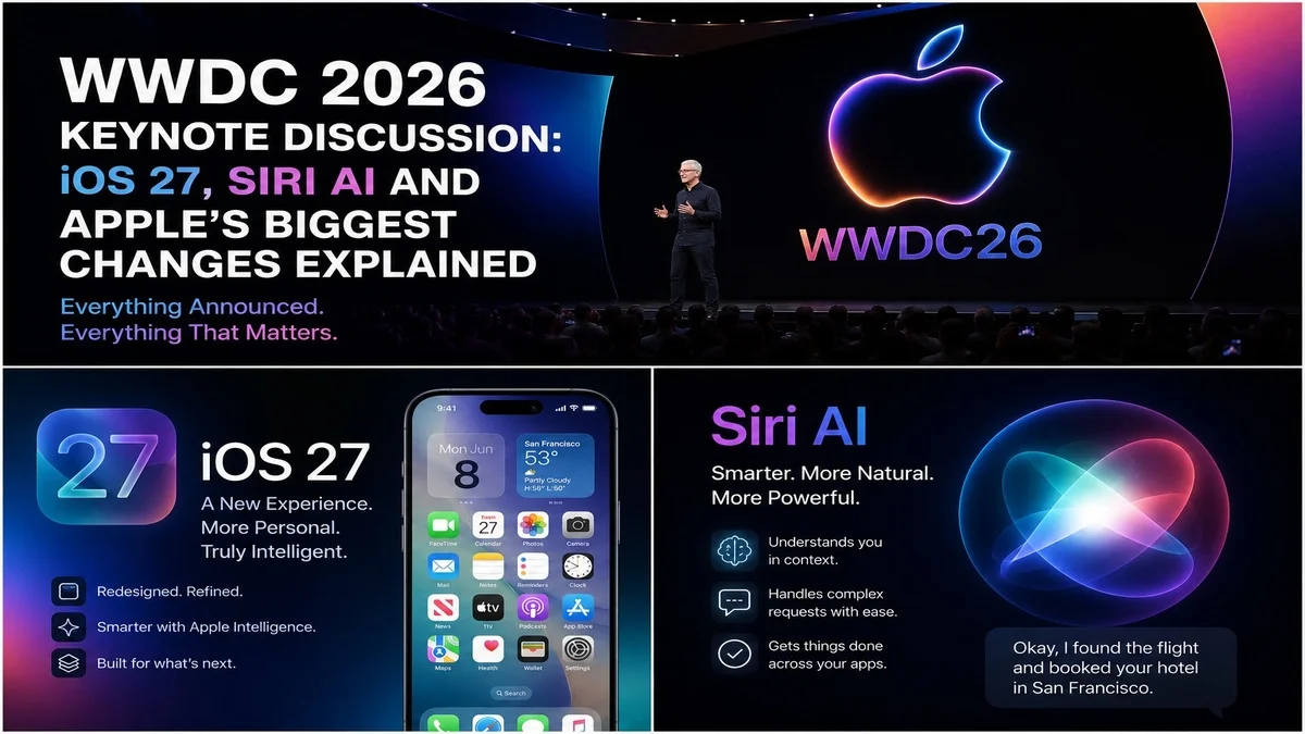
Liquid Glass iOS 27: What Apple Changed After User Complaints
Liquid Glass iOS 27 is one of the most interesting design stories from Apple’s latest software update. Apple introduced the Liquid Glass visual style earlier, but many users complained that the design looked too transparent, too busy or harder to read in some areas.
Now, Apple appears to be listening. With iOS 27, the company is refining the Liquid Glass experience by giving users more control over transparency, improving contrast and making the interface easier to read.
This matters because iPhone design is not only about looking modern. It also needs to feel clear, comfortable and practical every day.
What Is Liquid Glass iOS 27?
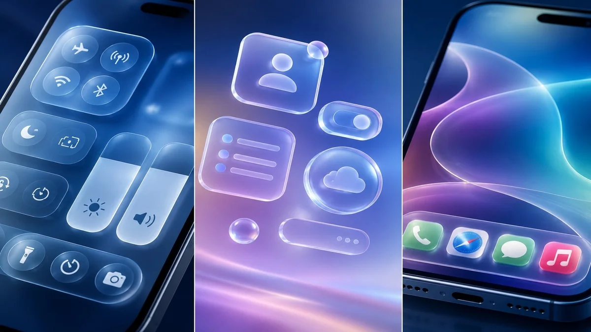
Liquid Glass iOS 27 refers to Apple’s updated transparent design style in the latest iPhone software. The design uses layered glass-like effects, blur, reflections and depth to make iOS look more modern.
Apple first introduced Liquid Glass as a new visual direction across its software platforms. The idea was to make apps, menus and system elements feel more fluid and expressive.
However, the design also created debate. Some users liked the premium look, while others said it reduced readability and made text harder to see.
For official background on the design language, Apple previously explained its new software design on the Apple Newsroom, where it described Liquid Glass as a way to make apps and system experiences more expressive.
Why Apple Changed Liquid Glass
Apple changed Liquid Glass because user feedback mattered. A design can look beautiful in screenshots, but it must also work well in real use.
Many users complained about transparency, readability and contrast. In simple words, some parts of the interface looked stylish but were not always easy to read.
That is a serious issue because people use iPhones in many conditions, including bright sunlight, dark rooms, moving cars and busy public spaces. If the interface becomes harder to read, the design fails its main job.
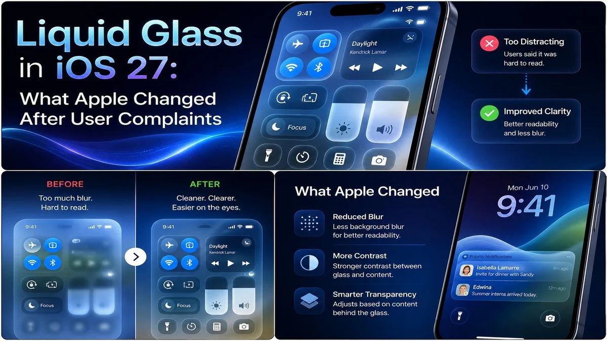
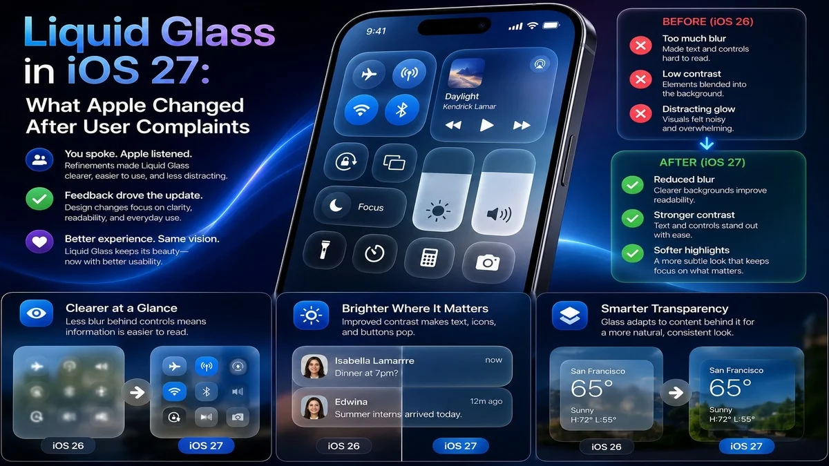
The Biggest New Change: Transparency Control
The biggest Liquid Glass iOS 27 change is the new transparency or opacity control. This gives users more control over how strong the glass effect looks.
Instead of forcing everyone to use the same level of transparency, Apple now lets users adjust the visual style based on personal preference.
This is a smart move because different users have different needs. Some people like a clear glass effect, while others prefer a more solid and readable interface.
Better Readability for Everyday Use
Readability is the main reason this update matters. If text, buttons and menus are hard to read, users will quickly become frustrated.
With iOS 27, Apple is improving contrast and giving users better control over the look of system elements. This should make menus, sidebars, panels and controls easier to see.
For many iPhone users, this may feel like a small change. However, for people who struggled with the previous design, it could make the phone much more comfortable to use.
Why Users Complained About Liquid Glass
Users complained because the original Liquid Glass design could sometimes feel too transparent. In some apps, text and icons appeared over busy backgrounds, making them harder to read.
Some users also felt the design looked distracting. Instead of helping them focus, the glass effect pulled attention away from the content.
This kind of feedback is important because Apple’s interface design affects millions of people. Even small readability issues can become big problems when they appear across the system.
Liquid Glass iOS 27 Makes Design More Personal
One of the best things about the new control is personalisation. Apple is not removing Liquid Glass completely. Instead, it is letting users adjust the effect.
That means people who like the modern transparent look can keep it. Meanwhile, users who prefer stronger contrast can reduce the glass effect.
This is a better solution than forcing one design choice on everyone. It gives users more freedom while keeping Apple’s visual identity.
Apple Is Fixing, Not Removing, the Design
Apple does not appear to be abandoning Liquid Glass. Instead, the company is refining it.
This is important because Apple often keeps its major design directions for years. When the company introduces a new visual system, it usually improves it over time rather than removing it quickly.
So, Liquid Glass iOS 27 should be seen as a correction, not a cancellation. Apple wants the design to stay, but it also wants it to work better.
Better Contrast Across the System
Contrast is one of the biggest parts of good interface design. If icons, text and buttons do not stand out enough, users may struggle to understand what they are seeing.
iOS 27 improves this by making the Liquid Glass effect more flexible. A stronger background or lower transparency can help important information stand out.
This will be especially useful in apps where menus, controls and text appear over colourful content.
Why Accessibility Matters
Accessibility is a major reason Apple had to respond. A design that looks beautiful but hurts readability can create problems for users with visual difficulties.
Better opacity control can help users who need stronger contrast. It can also help older users, people with light sensitivity and anyone who finds transparent interfaces distracting.
Good design should work for many people, not only for users with perfect viewing conditions.
How This Affects iPhone Users
For normal iPhone users, the change should make iOS 27 easier to customise. If the Liquid Glass effect feels too strong, users can reduce it.
This could make the interface feel cleaner, calmer and easier to read. It may also reduce eye strain for people who spend many hours on their phone.
In daily use, the biggest benefit is simple: users get more control over how their iPhone looks and feels.
Liquid Glass and iOS 27 Design Direction
Liquid Glass is still part of Apple’s wider iOS 27 design direction. Apple wants iPhone software to feel modern, layered and visually polished.
However, iOS 27 shows that Apple also understands the need for balance. A design should not only look futuristic. It should also support comfort, clarity and speed.
This balance could make Liquid Glass more acceptable to users who disliked the original version.
How It Connects With iOS 27 Features
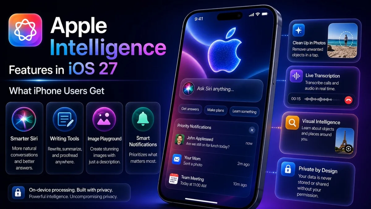
The Liquid Glass design update is only one part of iOS 27. Apple is also focusing on Siri AI, Apple Intelligence, Photos improvements, Safari updates, Passwords changes and performance refinements.
You can read our full Mobile Verse guide on the iOS 27 update to see how Liquid Glass fits with Siri AI, Apple Intelligence and new iPhone features.
Liquid Glass vs Older iOS Design
Older iOS designs often used flatter panels, clearer backgrounds and more traditional app layouts. Liquid Glass is different because it uses transparency and depth.
The older style felt simpler and easier for some users. The newer style feels more modern but can also look busier if the transparency effect is too strong.
With iOS 27, Apple is trying to combine both ideas: modern visuals with better readability.
Why Apple Needed a Slider
A slider makes sense because users do not all want the same design. Some users may want a strong glass effect because it looks premium. Others may want a more solid interface because it feels easier to read.
A simple slider gives both groups what they want.
It also reduces complaints because users can adjust the experience instead of waiting for Apple to change the whole design.
Liquid Glass on macOS and Other Apple Platforms
Liquid Glass is not only an iPhone design story. Apple has also used the design across other platforms, including macOS and iPadOS.
Reports say macOS Golden Gate also gets Liquid Glass refinements, including better interface control and improved visual clarity.
This matters because Apple wants a consistent design across iPhone, iPad and Mac. If the company improves Liquid Glass on one platform, the same direction may influence the others.
Will Users Like the New Version?
Many users may like the new version more because it gives them control. People who disliked the original transparency can reduce it, while fans of the design can keep the glass effect.
However, not everyone will be satisfied. Some users may still prefer the older iOS look completely.
That is normal with big design changes. Apple’s challenge is to make Liquid Glass flexible enough that most users can live with it.
Should You Use the Transparency Slider?
Yes, users should try the transparency slider after installing iOS 27. It can help you find the right balance between style and readability.
If your screen feels too busy, reduce the transparency. If you like the modern glass effect, keep it higher.
The best setting depends on your eyesight, wallpaper, app usage and personal preference.
What Apple Still Needs to Improve
Apple still needs to make sure Liquid Glass works well in every app. System controls may improve quickly, but third-party apps also need to handle the design properly.
Developers may need to test their apps carefully to make sure text, buttons and menus remain readable.
Apple also needs to keep accessibility options easy to find. If users cannot find the right setting, the feature will not help enough.
How Developers Should Think About Liquid Glass
Developers should treat Liquid Glass carefully. A transparent interface can look good, but it can also create contrast problems if the content behind it is too busy.
Apps should avoid placing important text over confusing backgrounds. They should also test readability in light mode, dark mode and different wallpapers.
This is especially important for news apps, shopping apps, finance apps, travel apps and any app where users need to read information quickly.
Why This Topic Matters for Mobile Verse Readers
This topic matters because iPhone users care about both design and usability. A phone can have powerful AI features, but people still interact with the interface every day.
If the design feels uncomfortable, the whole update feels weaker.
Liquid Glass iOS 27 is a good example of how Apple is trying to balance beauty with practical use.
Final Thoughts
Liquid Glass iOS 27 shows that Apple is listening to feedback. The company is not removing its new design language, but it is making it more flexible, readable and user-friendly.
The new transparency control is the most important change because it gives users more freedom. Better contrast and readability improvements also make the design easier to use.
Overall, this update could help Liquid Glass become a stronger part of the iPhone experience instead of a design choice that divides users.
FAQs
What is Liquid Glass iOS 27?
Liquid Glass iOS 27 is Apple’s updated transparent design style for iPhone software, with better control over opacity, readability and contrast.
Why did Apple change Liquid Glass?
Apple changed Liquid Glass because users complained about readability, transparency and contrast in the earlier design.
Does iOS 27 remove Liquid Glass?
No, iOS 27 does not remove Liquid Glass. Apple refines the design and gives users more control over the effect.
What does the Liquid Glass slider do?
The slider lets users adjust how transparent or solid the Liquid Glass effect appears on their device.
Is Liquid Glass better in iOS 27?
Yes, it should feel better for many users because iOS 27 adds stronger readability control and more flexible transparency settings.